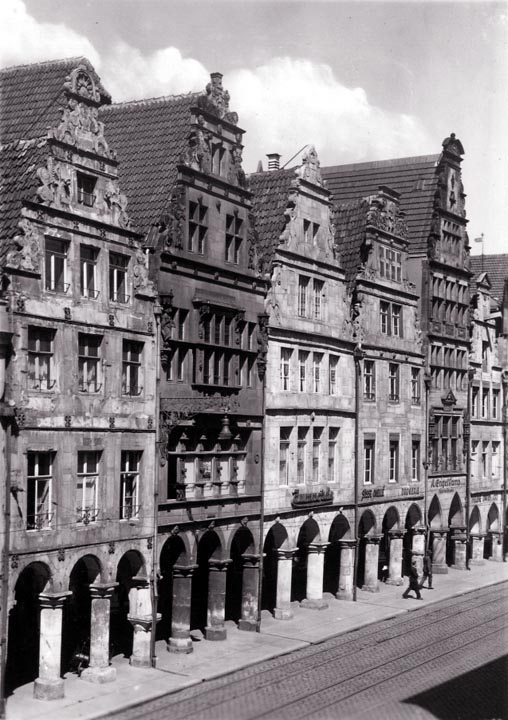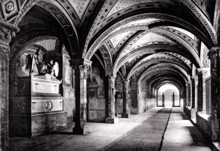
This is a rather stolid arcade. It works perfectly well, but the proportions are not as graceful as in either of the two previous examples. This has to do mainly with the rather chunky columns and the comparatively low height of the arches. It's very sturdy, but not so attractive. Worse still is square columns, often seen in modern construction, as they block off a great deal more of the light while adding comparatively little to the strength of the column.
|
 Next City Design Home
E-mail |