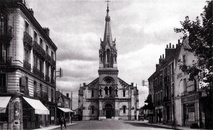
This church lacks some of the refinement of most of the others we have seen. It's worth analyzing in some detail. The first problem is that the main arch is much too close to the round window below it. This gives the building a slightly sinister appearance. The arch is round, which is the least interesting shape of arch. The arch is neither centered on the base of the window, nor on its center. The windows are not of a pleasing proportion, and the spire is too heavy for the rest of the building. The door is too small. The decoration has an almost military character - it is inappropriate for a church. It could be argued that the front steps ought to be both higher and wider. The power or telephone line racks, one on each side, are truly offensive and doubtless have been removed today. All in all, it's a rather gloomy building.
|
 Return to City Design Home
E-mail |