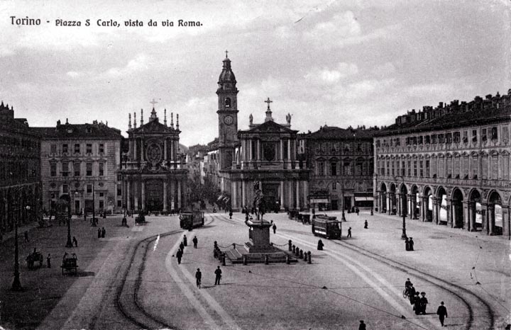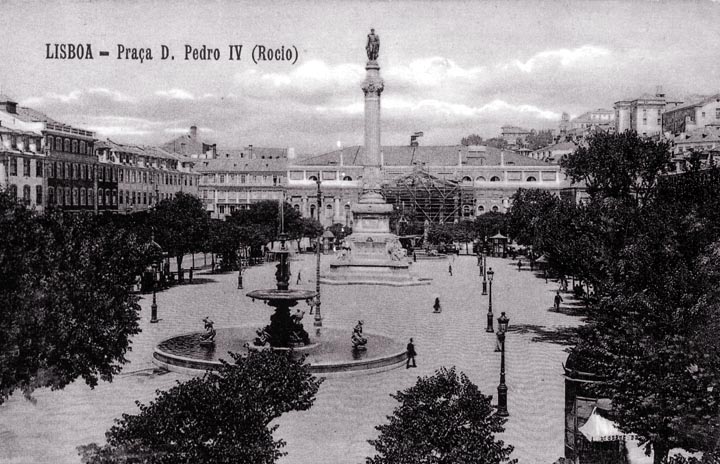
This gorgeous square is today used as a parking lot, about the best we can expect in the city that is home to auto-giant Fiat.
Rigid formality is expressed in the symmetry - notice the two nearly matching churches in the center of the view.
Notice the paths taken by the trams. This would not have been arranged in this fashion except for aesthetic reasons - from an operating point of view, this arrangement is less than ideal, introducing unnecessary curvature into the tracks. The trams should really have been kept out of this square if at all possible. While I have noticed that, in cities, with busy tram systems, the ebb and flow of people in squares like this one is regulated by the arrival and departure of trams, and that the trams are the source of a great deal of foot traffic that adds life to the square, their presence is really a serious irritant and source of danger. Often, in the Leidseplein, Amsterdam's busiest, if not largest, square, the acts of street performers are nearly drowned out by the screeching of trams rounding the curves in the square. Ideally, trams should have stops located near, not in, squares, and the tracks should not pass through them. Notice the conflict in shapes between the run of the rails and the white stone. This must have posed a real dilemma for those deciding how to handle the layout of the tracks. As it is, the tracks have to cross the white stone paths.
|
 Next City Design Home
E-mail |