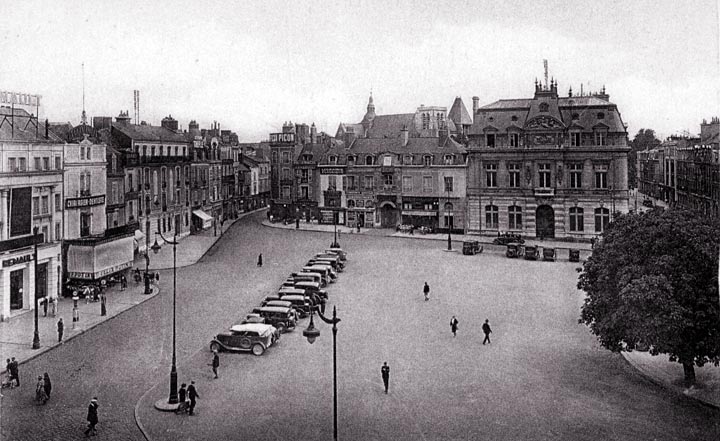
We see here something unusual. Rather than allow the cars to park in long strings along the curb, they have been make to park in a row in the middle of the square. While this does not help the square any, the definition of the street remains intact as a result. Notice how clean the line of the curb appears, and contrast this with the appearance of streets today, with their endless rows of parked cars.
Notice the ugly (doubtless illuminated) sign on the roof of the building at the extreme left. While this is not a particularly fine building to begin with, the sign does nothing to help. Does anyone know the state of this square today?
|
 Next City Design Home
E-mail |