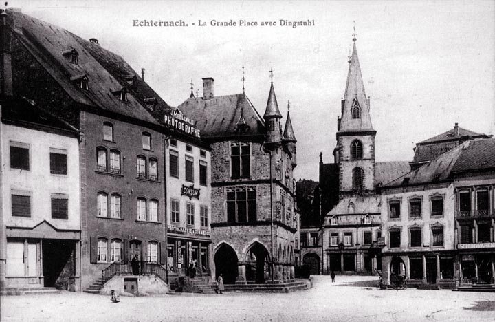
The plan of this square may at first appear somewhat haphazard, but notice that the arrangement draws attention to the church, which, while not a spectacular building, is pleasing. There is a problem with the buildings on the left. Two of them have their entrance floors elevated considerably above the square. While the double staircase on the dark building can be satisfactory, it really belongs to a larger building. The basement entrance is a logistical nightmare - it is very difficult to get things in or out of the basement due to the steep stairs, which present a serious danger to pedestrians, who may blunder into them in the dark. This arrangement should be prohibited in new construction. There is no good reason that the building that carries the ugly "photographe" on the roof should have had its first floor so much elevated. The building to its right is clearly of some importance (it may even be the city hall), and its arcade is elevated a few steps above the square, but is lower than the porch of the building to its left. This is really artless. The building on the extreme left already has the modern disease - roll up shutters. These are a blot on buildings throughout Belgium and Portugal today, and I doubt that this problem is limited to these two countries. Notice how they have created a blind look to the building, and the boxy containers for the rolled-up shutters don't look right. The windows, which once had reasonable, if not great, proportions, are now square. I call the practice of destroying a building by poking out its eyes "defenestration." Just as with the other meaning of the word, it's death for sure.
|
 Next City Design Home
E-mail |