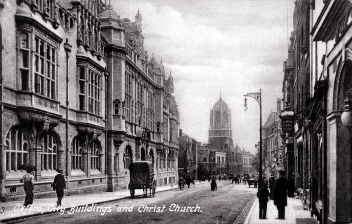
Despite the high quality of the building on the left, this is not a terribly attractive street. In the first place, the roadway is too broad and the sidewalks too narrow. As we have seen earlier, the most attractive street has no roadway at all - the pavement is unbroken across the full width of the street. Still, if traffic must be accommodated on a street, it seems necessary to separate pedestrian traffic from wheeled traffic, and a roadway with curbs is a clear and simple means to achieve this. (It also facilitates drainage, as curb drains can be arranged to carry off water from both the roadway and the sidewalk.) Another fundamental problem is that the building on the left has no visible doorways (there may be one behind the horse cart). A strong argument can be made for small-scale stores or offices on the ground floor of most buildings, which results in entrance doors at short intervals. This makes a street much more welcoming. (Some streets have doorways every couple of meters, because there will be a door into a store, followed by a door leading to a stairway, and repeat.) The tower in the distance is not inspiring. It is short and squat and the dome is not well articulated - a stone course separating the top of the tower from the bottom of the dome would have corrected this.
Notice the graceful street lamp.
|
 Next City Design Home
E-mail |