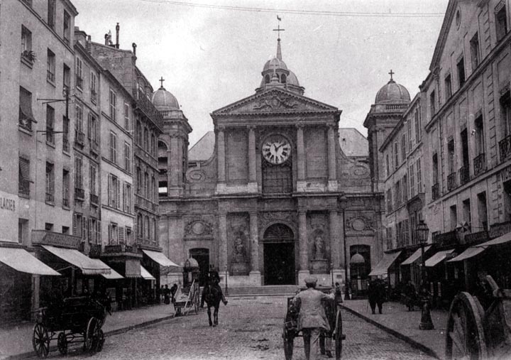
Again we have a street that does not appear to have anything wrong with it, and yet it is somehow not entirely satisfactory. I think the problem begins with the fact that it is nearly square (especially when the visual effects of the roof dormers is considered). This leads to a static feel that is not much helped by the church, which is somewhat boxy. The way the main roof sticks its shoulders up above the main façade is also disturbing. The louvers in the bell tower should have been made smaller. The clock is too big. The roadway appears to be unnecessarily wide, and the sidewalks narrower than they could otherwise be. Broader sidewalks would permit the stores and cafés to flow out onto the street, which adds a great deal of life to the street.
The street is slightly cluttered by the bracket for telephone wires. Why did the photographer choose to stand a little to the right of the street's centerline?
|
 Return to City Design Home
E-mail |