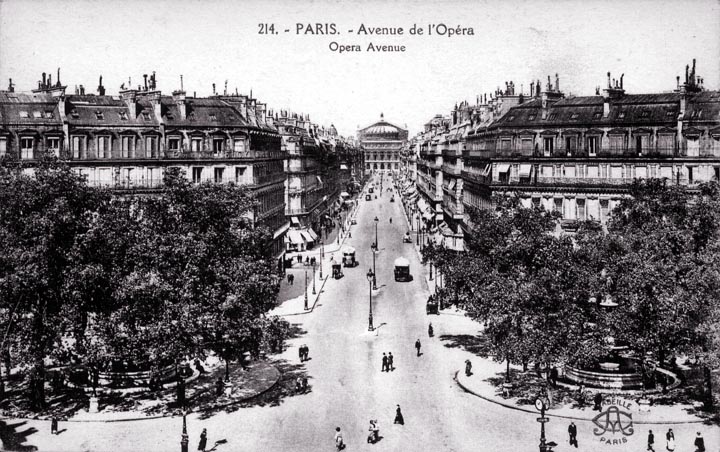
This is the same neighborhood in Paris as the previous photograph. The street is much the same, but the presence of the imposing opera house at the end of the street gives a very different feel to this street. (It is important to note that the high camera angle also makes the perspective more interesting and gives a better view of the street.) This is another neighborhood that demonstrates a harmony of various designs that stem from a common style. Lamp posts are no longer placed in the middle of the street, which is in most respects the best place for them. It's because cars would run into them, of course. The shady circles must have been lovely places to rest on a hot summer's day, until the stink and noise of motorized traffic demolished the peacefulness of the street.
|
 Next City Design Home
E-mail |