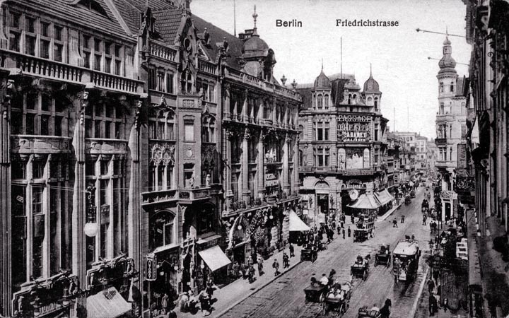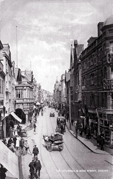
Until the Bauhaus movement made it taboo, the Germans had a love of ornamentation that probably still lurks in most citizens. In fact, it seems that it is principally architects who like modern, faceless building bereft of any ornamentation. Given half a chance, I think the Germans will reclaim their ornamental heritage, as will the rest of humanity. Erik Rauch advises that "the southern German tradition of decorative painting of building facades is still alive in towns in parts of southern Germany. Even some modern buildings are painted." The proportions of this street are just enough different from the Paris streets that it has a different feel to it. The street is somewhat narrower, while the buildings are about the same height. There are two basic proportions in streets - under-square and over-square. The under-square street is wider than the adjacent buildings are tall. The over-square street is the other way, of course. There is the possibility of a square street, but these are not so often seen. To my eye, over-square streets are generally more attractive than under-square ones. In Venice, we reach one extreme of the over-square street - some streets there are 3 meters wide and are fronted by buildings 15 or more meters high. Many people find these proportions claustrophobic, and they probably should only be applied in some areas of a city. Manhattan is the other extreme of the over-square street. The proportions of some streets in Manhattan probably even more extreme than the narrow Venetian streets, although the buildings are in this case 50 stories tall, not 5, and the streets are 20 meters wide, not 3. Some people also find Manhattan claustrophobic.
|
 Next City Design Home
E-mail |