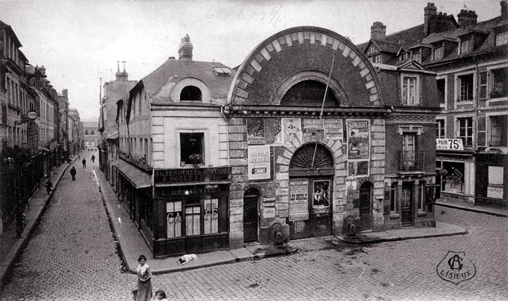
This is a generally reasonable square in most respects, but it fails. The causes, I believe, are two. In the first place, the building in the center is dreadful. The circular arch form repeated three times on the façade is static. The upper parapet serves no obvious purpose. The hodgepodge pasting of posters on this building does not help at all (it is either a cinema or an indoor marketplace). The U-shaped dormer on the left is hideous and does not balance at all with the quite acceptable dormer on the right.
The sign advertising something for 75 centimes takes us forward a century, to the time when such ugly signs would become so common as no longer to excite any notice. Despite their ubiquity, such signs are a real blot on our public spaces. Without the slight jog in the street to the left, it would be oppressive. It may be that the narrower streets become, the greater their need for articulation, however slight.
|
 Next City Design Home
E-mail |